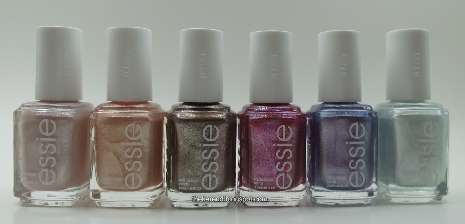
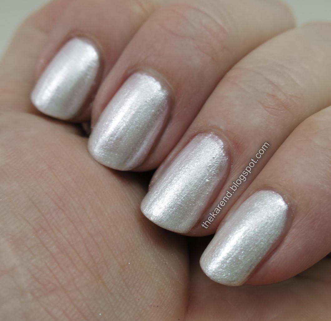
I began with Don't Be Salty, a pinkish beige shimmer. It surprised me that I got decent coverage in only two coats, unusual for such a light shade. The tradeoff for that is a formula that's thicker than I expected from an Essie.

I didn't use topcoat for my swatches, and once I took a close look at the photos, I wished I would have, as there's a bit of texture showing. It wasn't as noticeable to the eye, though.
Coral Coast was up next. This warm peach shimmer was also a two-coater. It seemed a touch more metallic than Don't Be Salty, and showed a few more brushstrokes than that one did.


I compared these first two to each other; Coral Coast on the left and Don't Be Salty on the right. For my skintone, Don't Be Salty is more flattering.

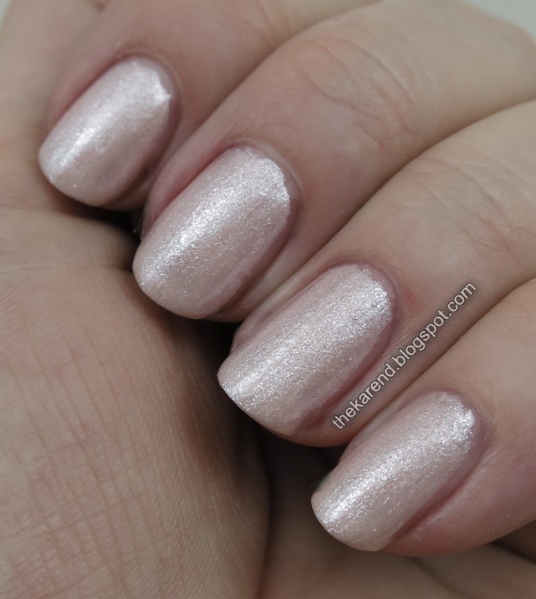
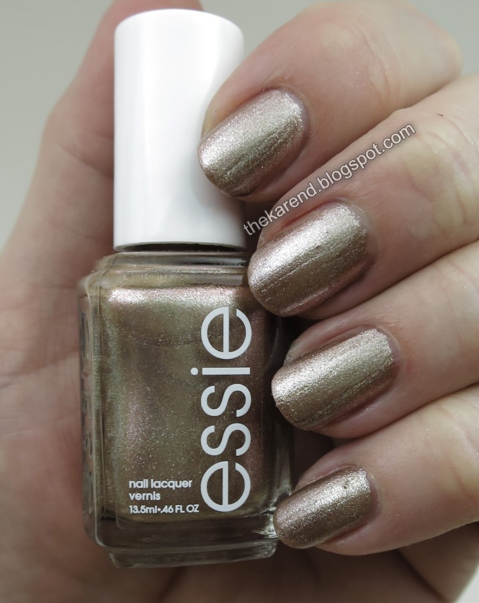
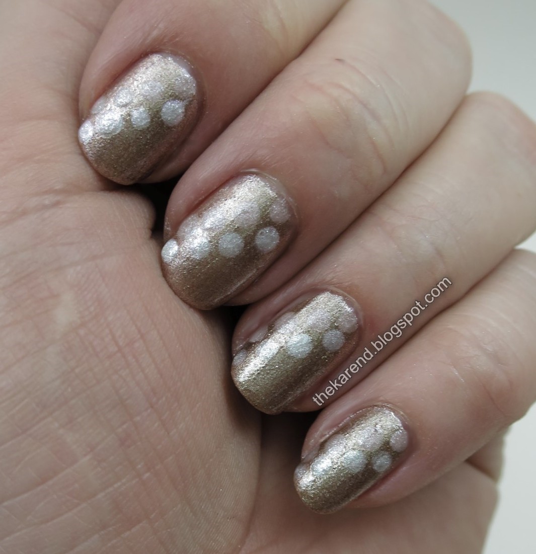
Staying in the neutral realm, I put on High Tides & Dives, a bronzey brown shimmer. I fancied I could see a hint of coppery flash in the bottle but didn't see that on the nail. This was two coats as well.

I added some dots of Don't Be Salty and At Sea Level to High Tides & Dives. I also added topcoat, which didn't help with the visual texture as much as I'd hoped. It was smooth to the touch but not the eye.
At Sea Level is an icy blue shimmer. I used two coats of this one as well; a hint of visible nail line showed up in the photos but wasn't evident to the eye.

At Sea Level got dots of Coral Coast, High Tides & Dives, and World Is Your Oyster. Coral Coast got lost against the background, leaving the overall design looking sort of wonkier than I'd planned.

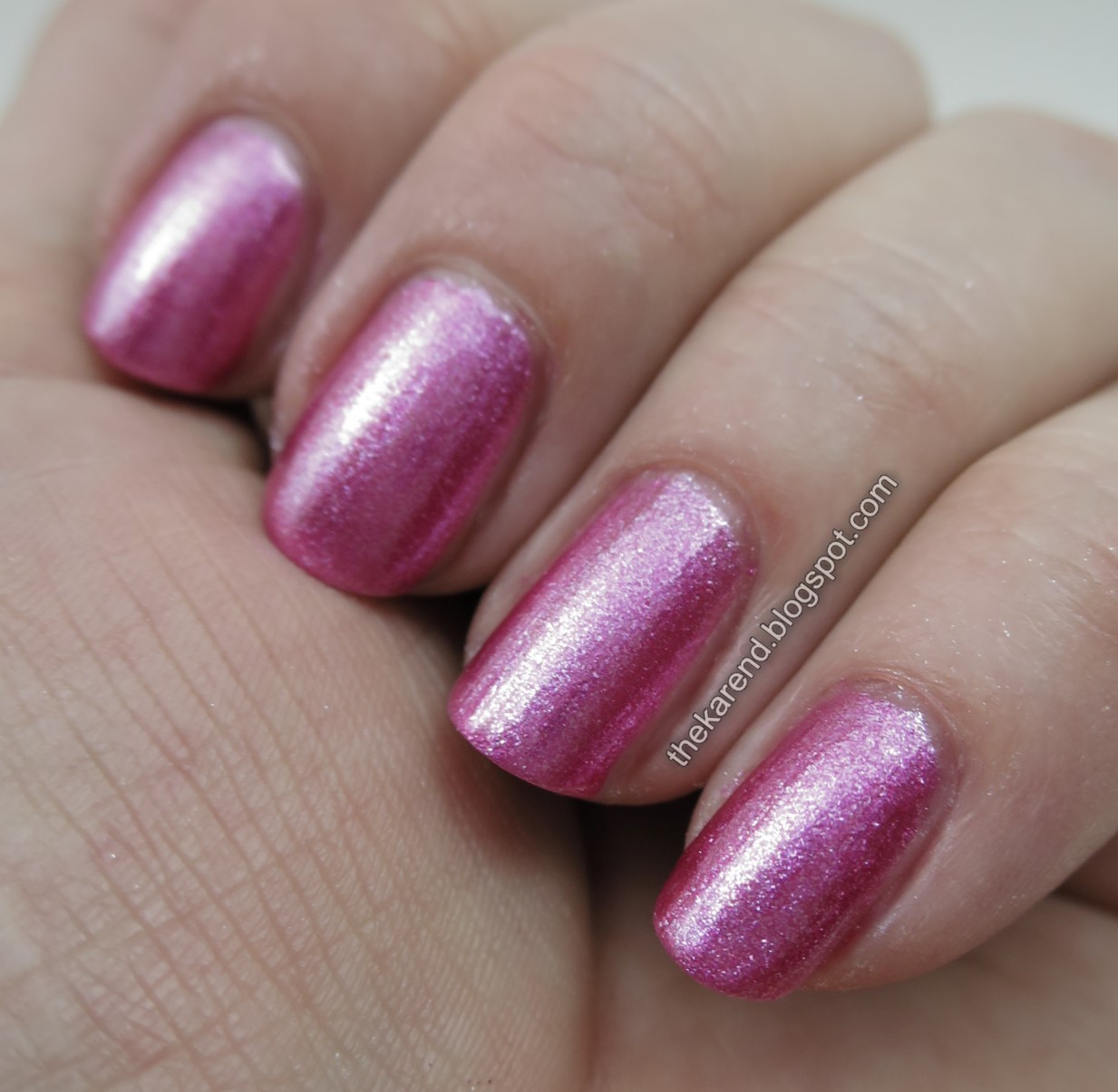
You Me & The Sea is a bright pink shimmer and another two-coater.

I added dots of Coral Coast and clear topcoat to You Me & The Sea; it contrasted much better with the pink than it had with At Sea Level.

Finally we have World Is Your Oyster, a light purple shimmer. I did two coats of this as well; that gave opaque coverage but I think a third coat would have added to the richness of this color.


To decorate World Is Your Oyster, I did dotted flowers with You Me & The Sea and Don't Be Salty, then added topcoat.

I didn't try layering with any of these as I usually would with light shimmers. I thought I would before I tried them, but as you can see, they're opaque enough that using them as toppers isn't something I felt made sense.
Overall, I liked this collection. Don't Be Salty is my favorite; I've been in the mood for quiet colors recently, and the finish on this one makes it interesting. Of course, World Is Your Oyster, being purple, also makes my must have list.

Hi dear Karen! The ones I prefer are the first and the last! The formula seems thick ad you said.
ReplyDeleteA big hug
They are all pretty. I especially like the pink one :)
ReplyDeleteDon't be Salty and At Sea Levels are complete winners! They look a bit on the suede side... or is it just my impression?
ReplyDeleteJust love your swatches! Beautiful collection! <3
ReplyDeleteDo you happen to know what the color code is on "the world is your oyster" i've been trying to find it everywhere in stores!
ReplyDelete